Nino’s
Nino’s Menu
I had never thought of food photography as a area that I would venture into. At the start of 2015 I got to work on a campaign for a local restaurant called Chez Nous. Photographing their main food dishes to be used for social media marketing, see blog post here : http://www.tylerdolan.com/blog/chez-nous . I really enjoyed this project, it was a simple yet crucial start into the world of food photography for me. After the Chez Nous campaign I researched as much as I could about food photography and experimented with various personal projects relating to food and the photography thereof.
When an advertising agency that I do regular work for asked me to get on board the Nino’s menu campaign I jumped at the opportunity. I love the creative process, finding what feel and mood is needed for a particular campaign and executing it. Yes this is just commercial food photography but its refreshing and vibrant and just fun to photograph. Our team for the campaign was great too as I got to work with a small team of friends. The team consisted of food stylist Janice Annetts and creative Director Kamal Padayachee.
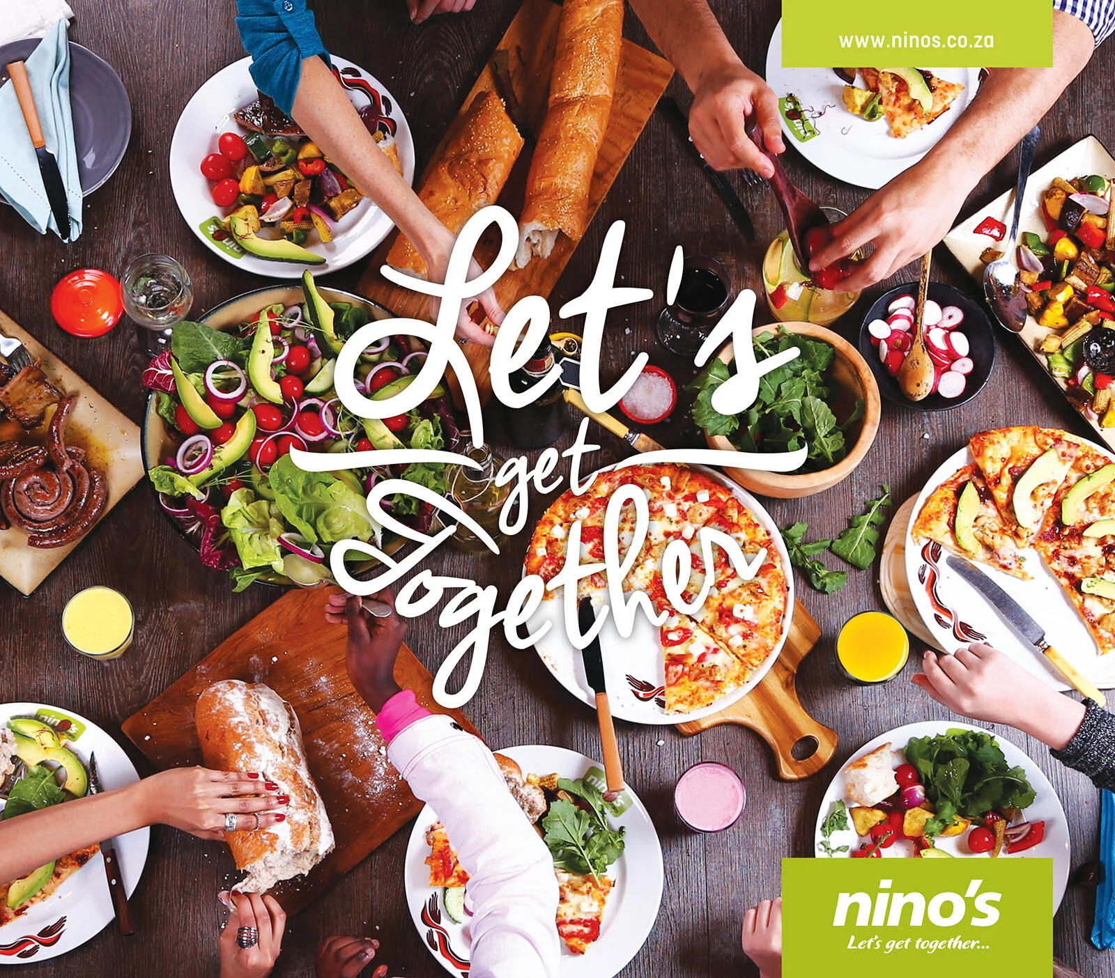
The idea behind the campaign was to revamp the Nino’s image with regards to their outdated images. We needed to create images that were fresh, vibrant and homey to fit with their client base and marketing strategies.
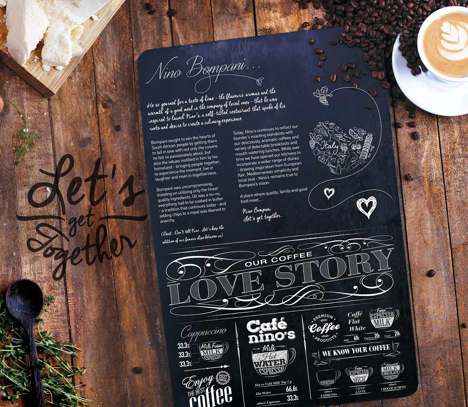
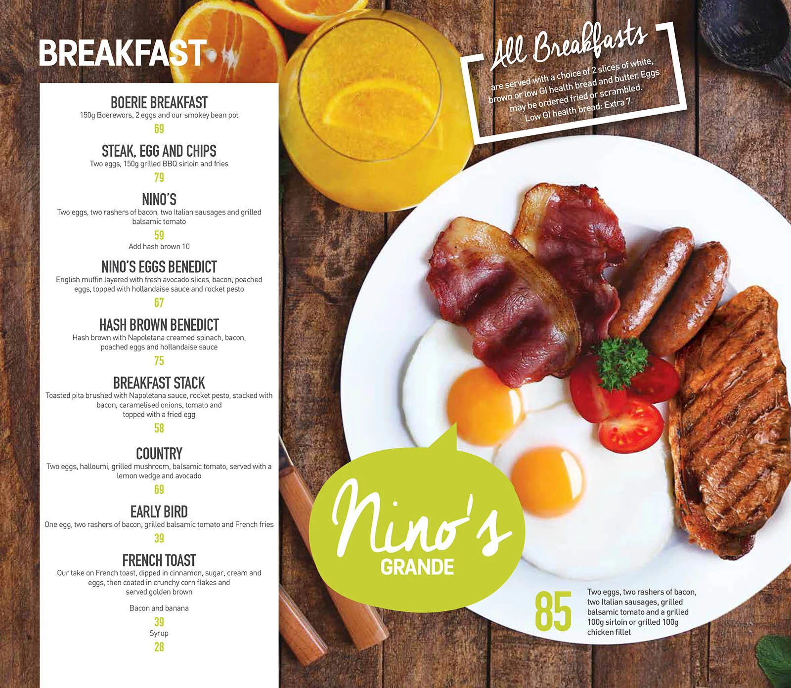
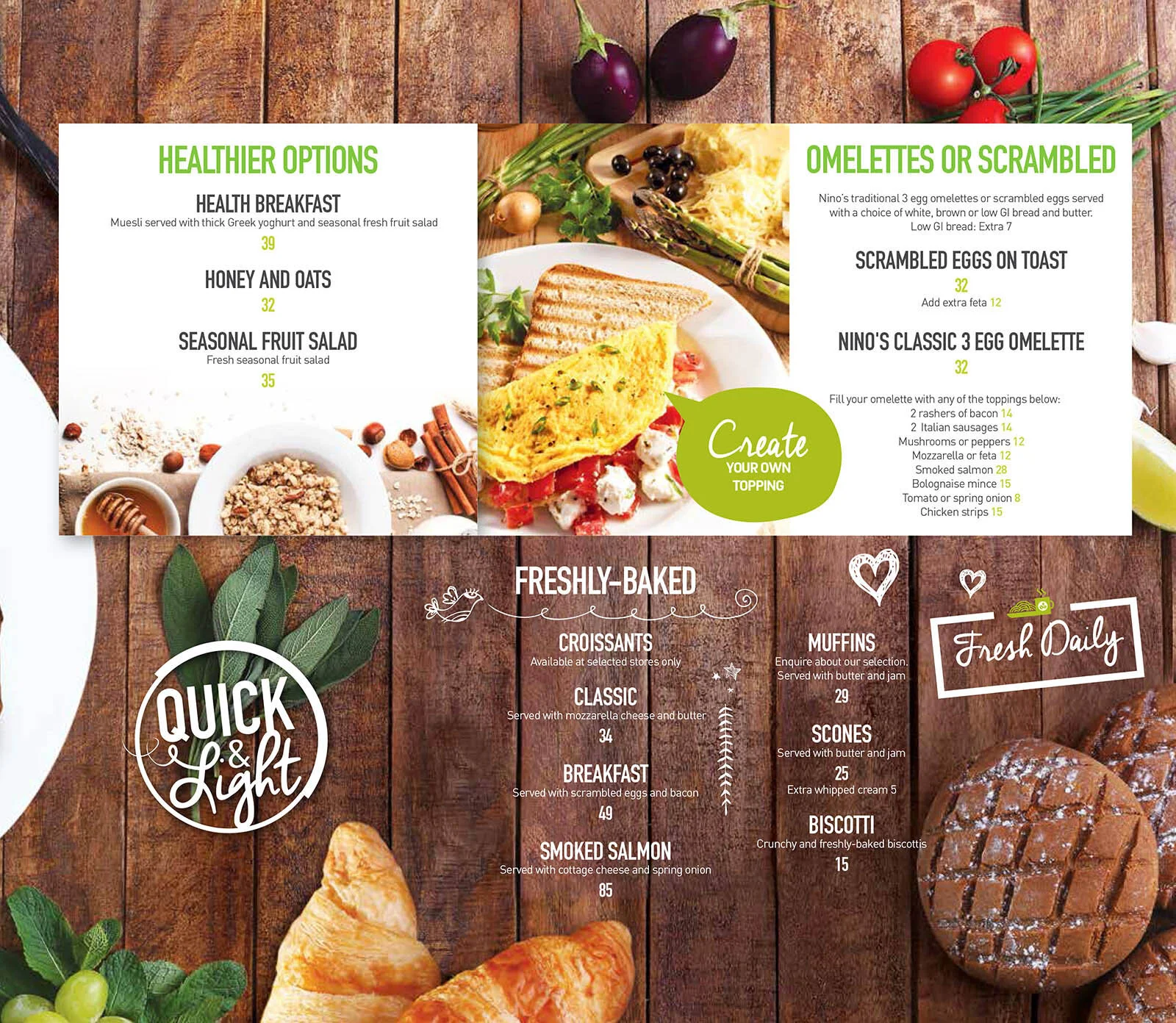
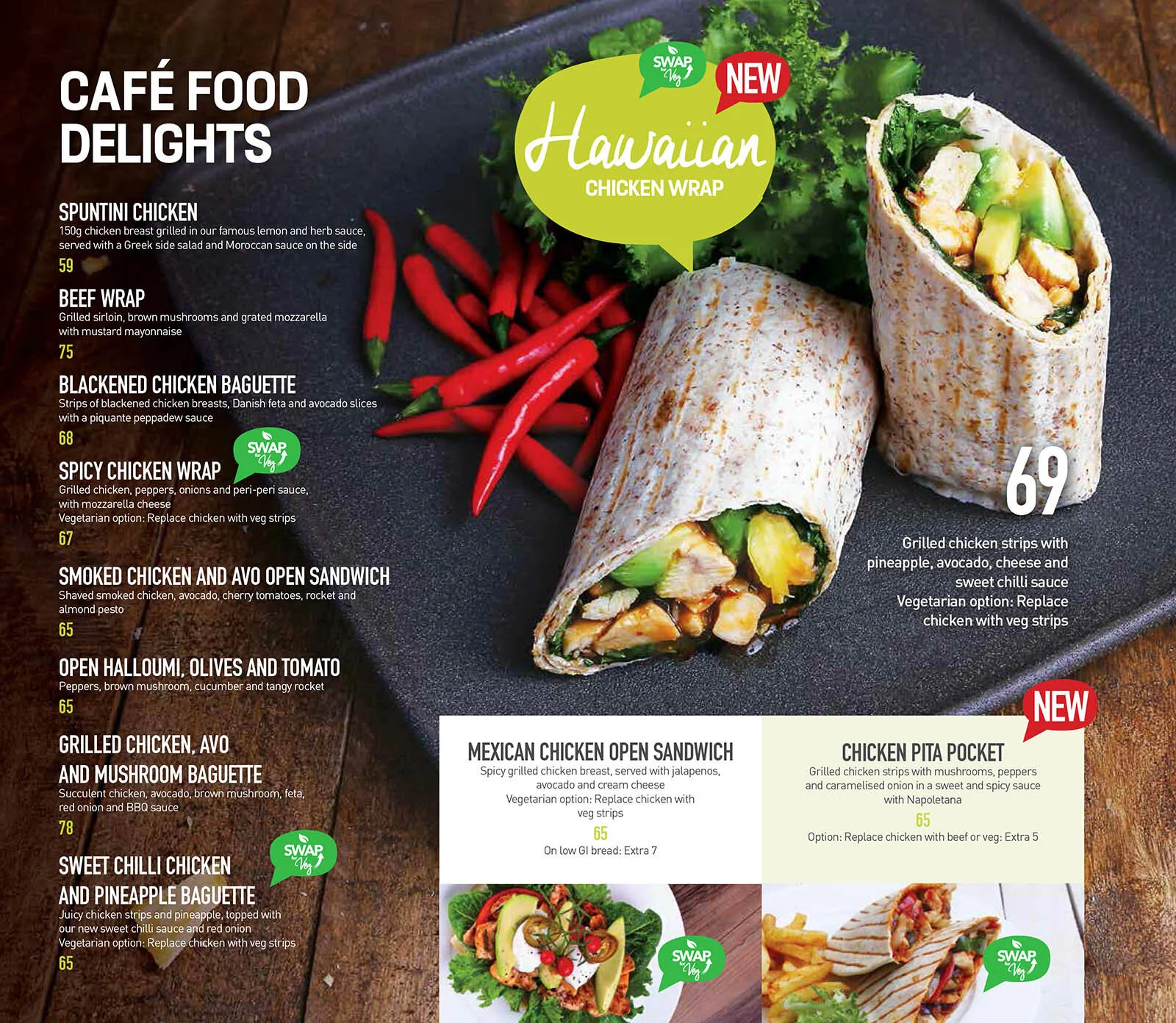
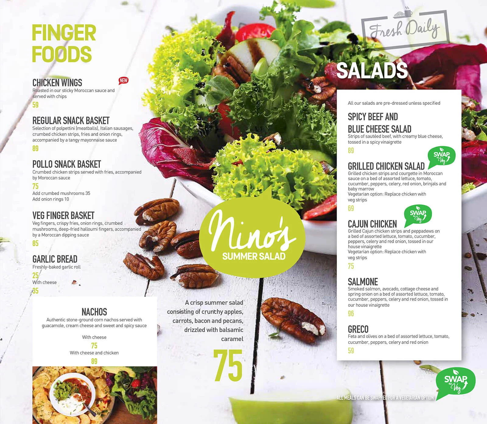
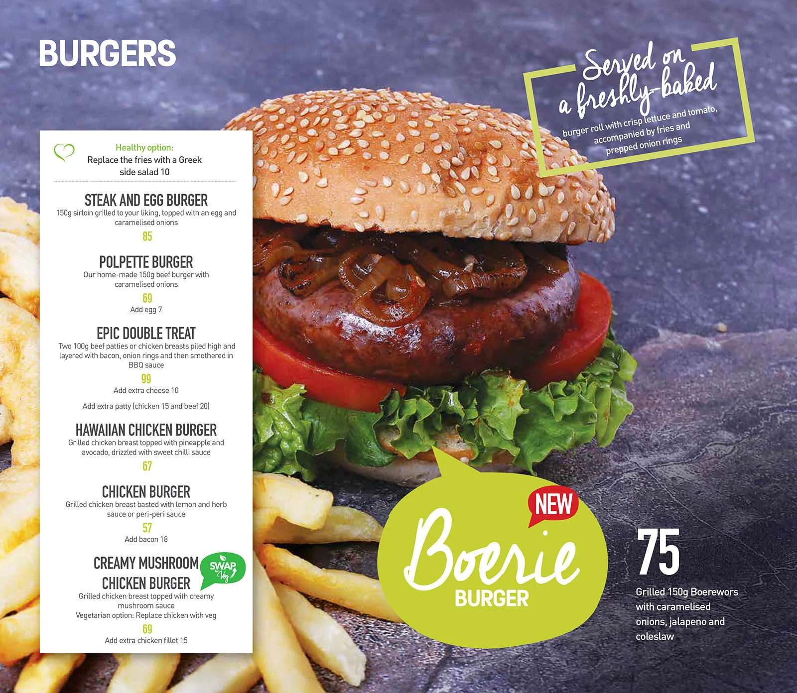
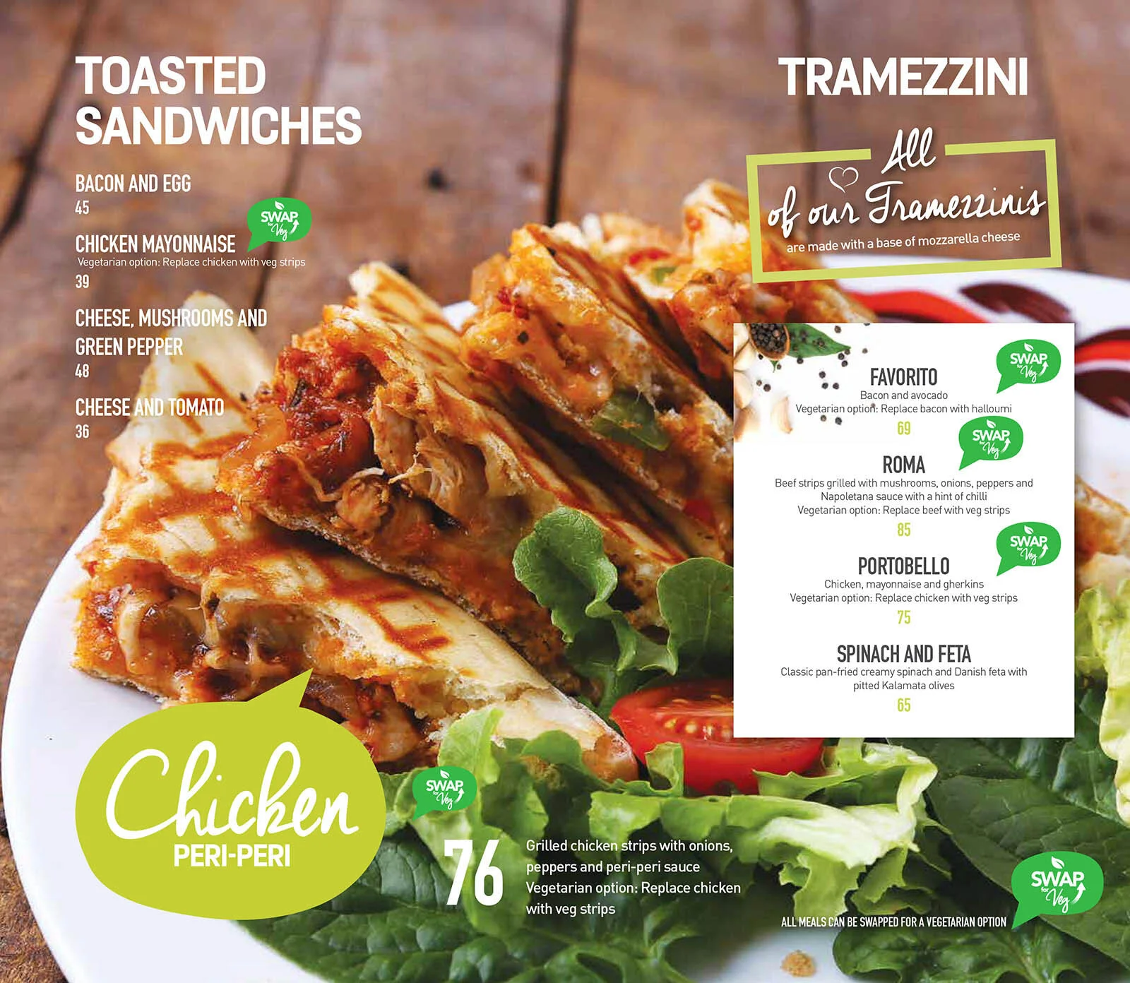
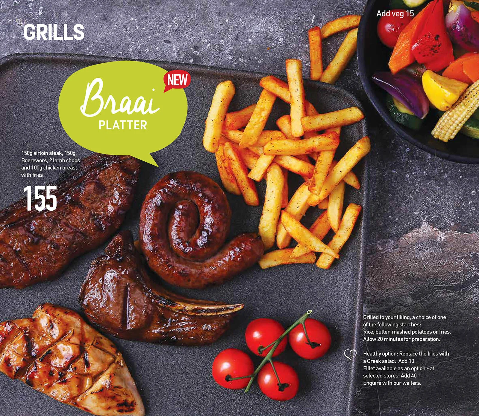
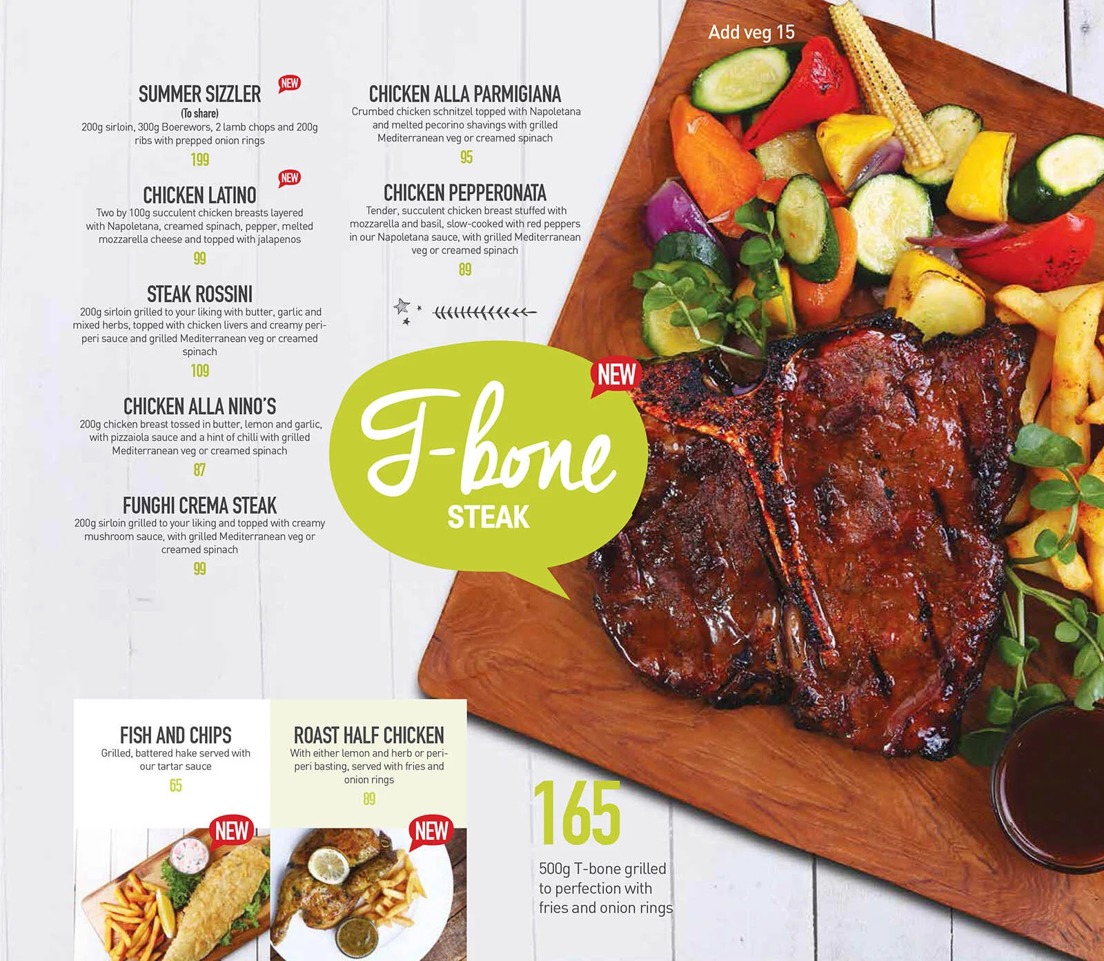
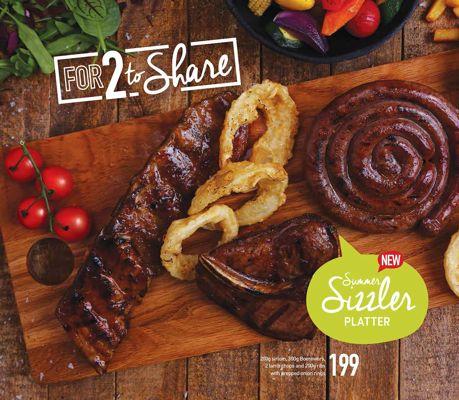
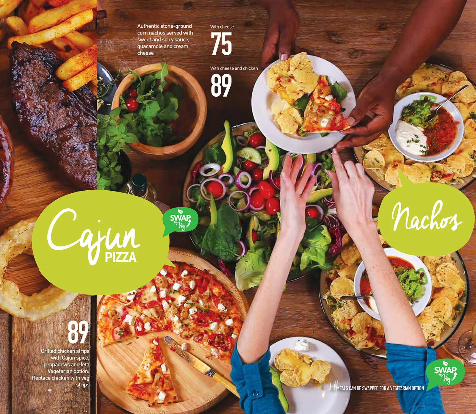
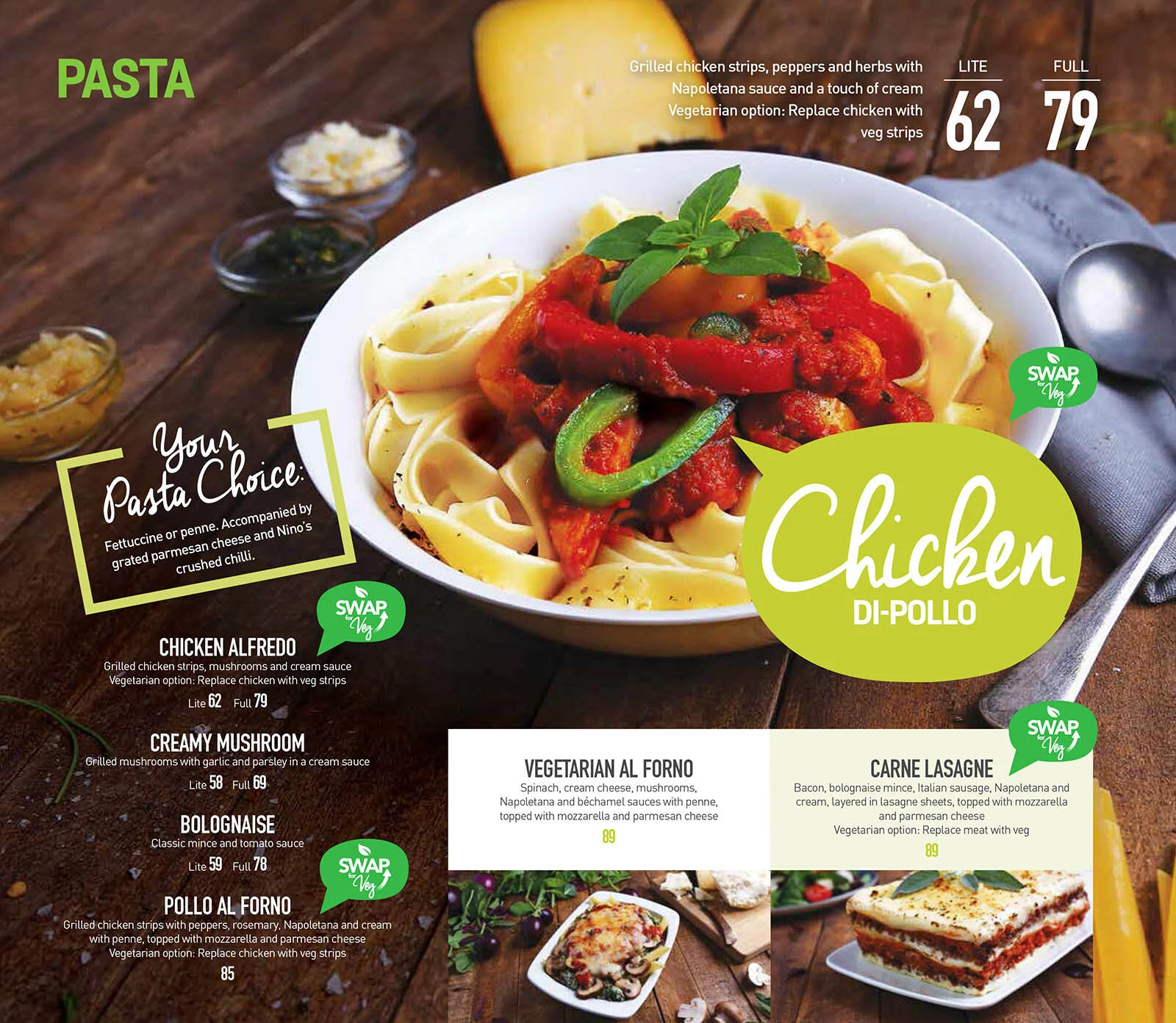
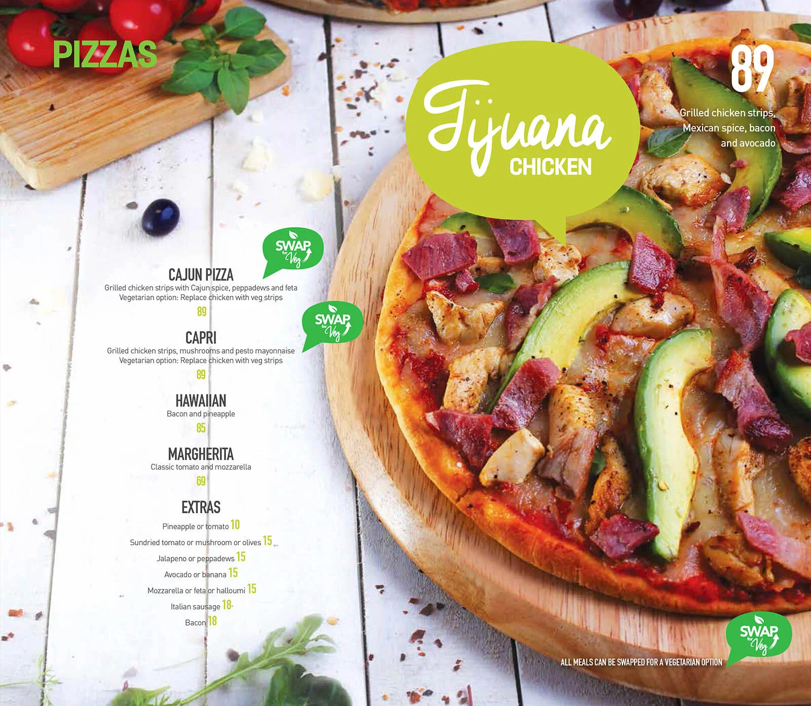
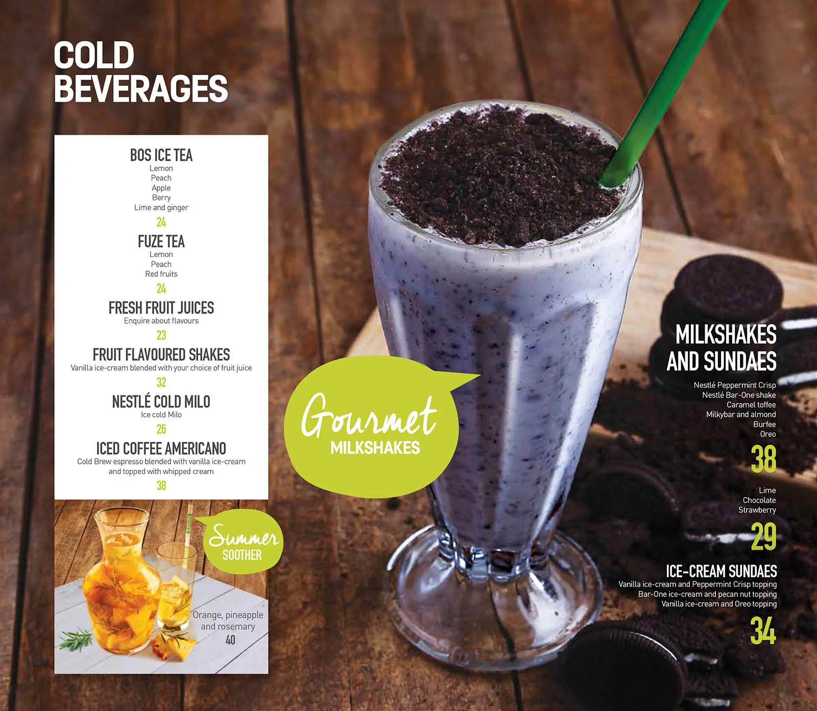
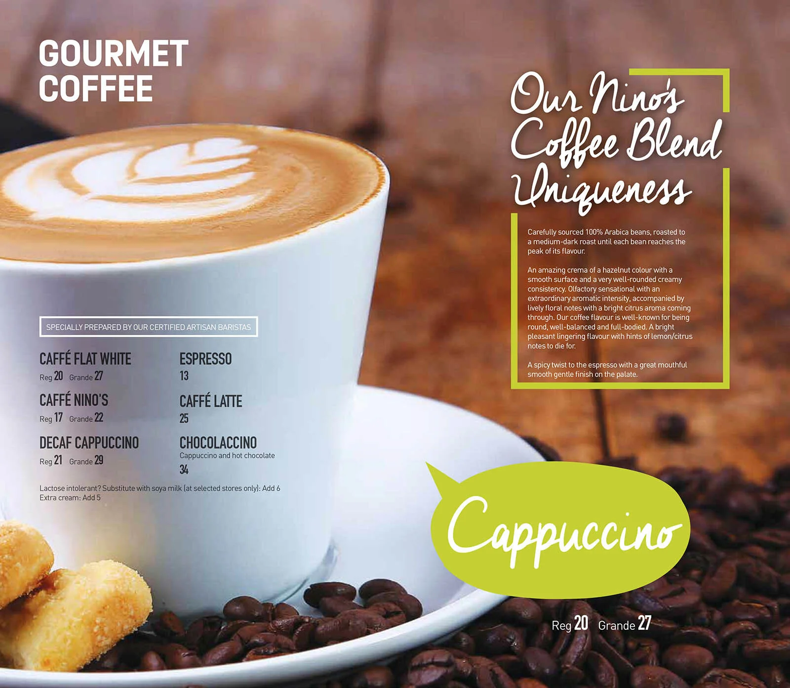
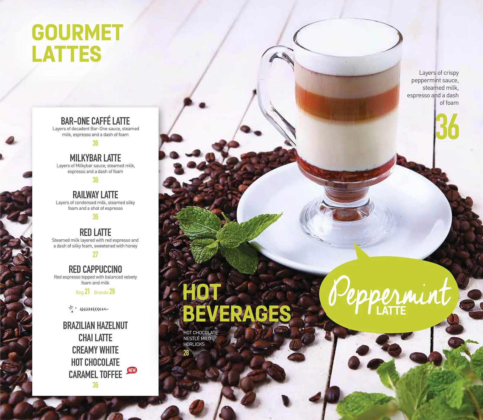
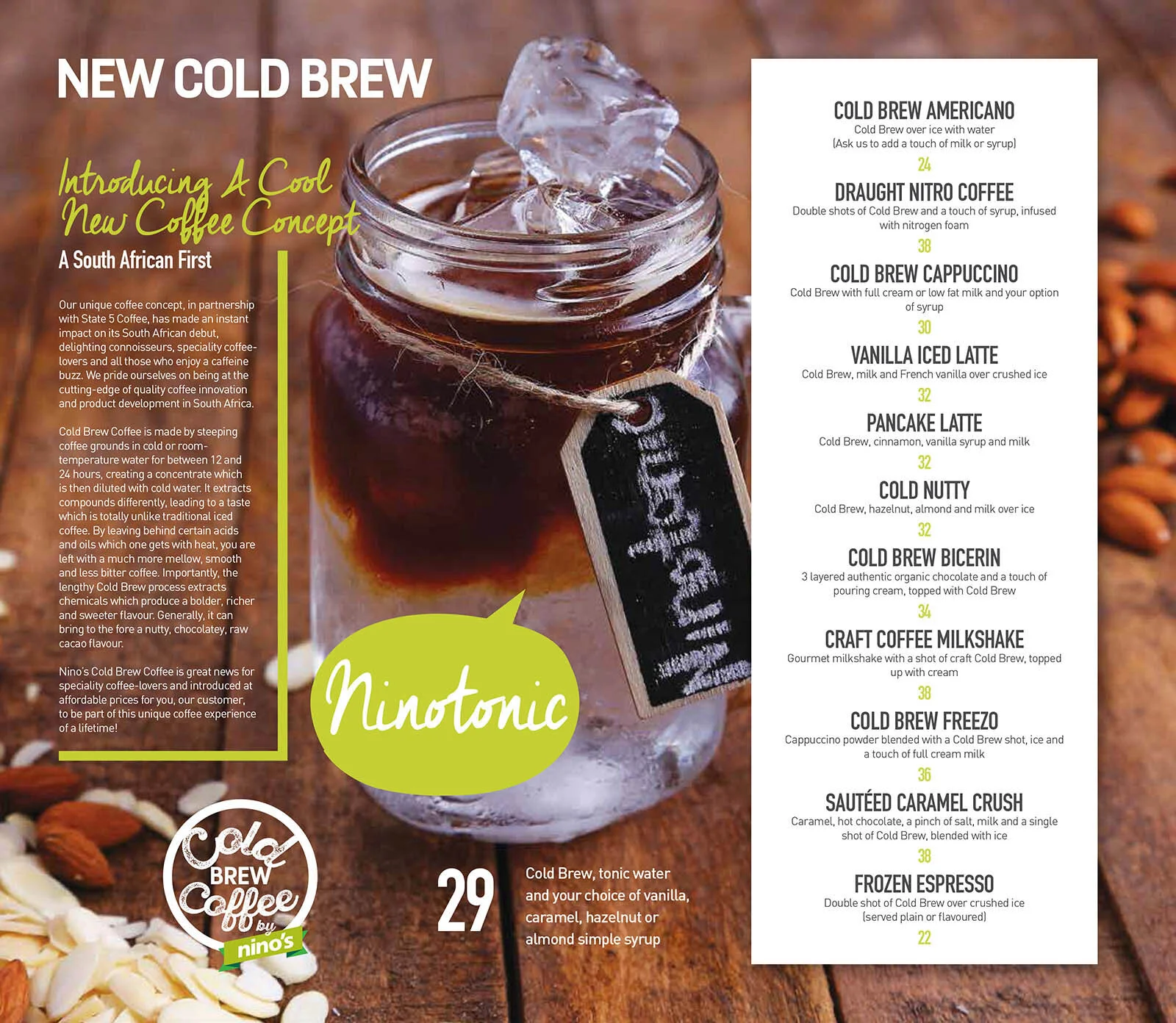
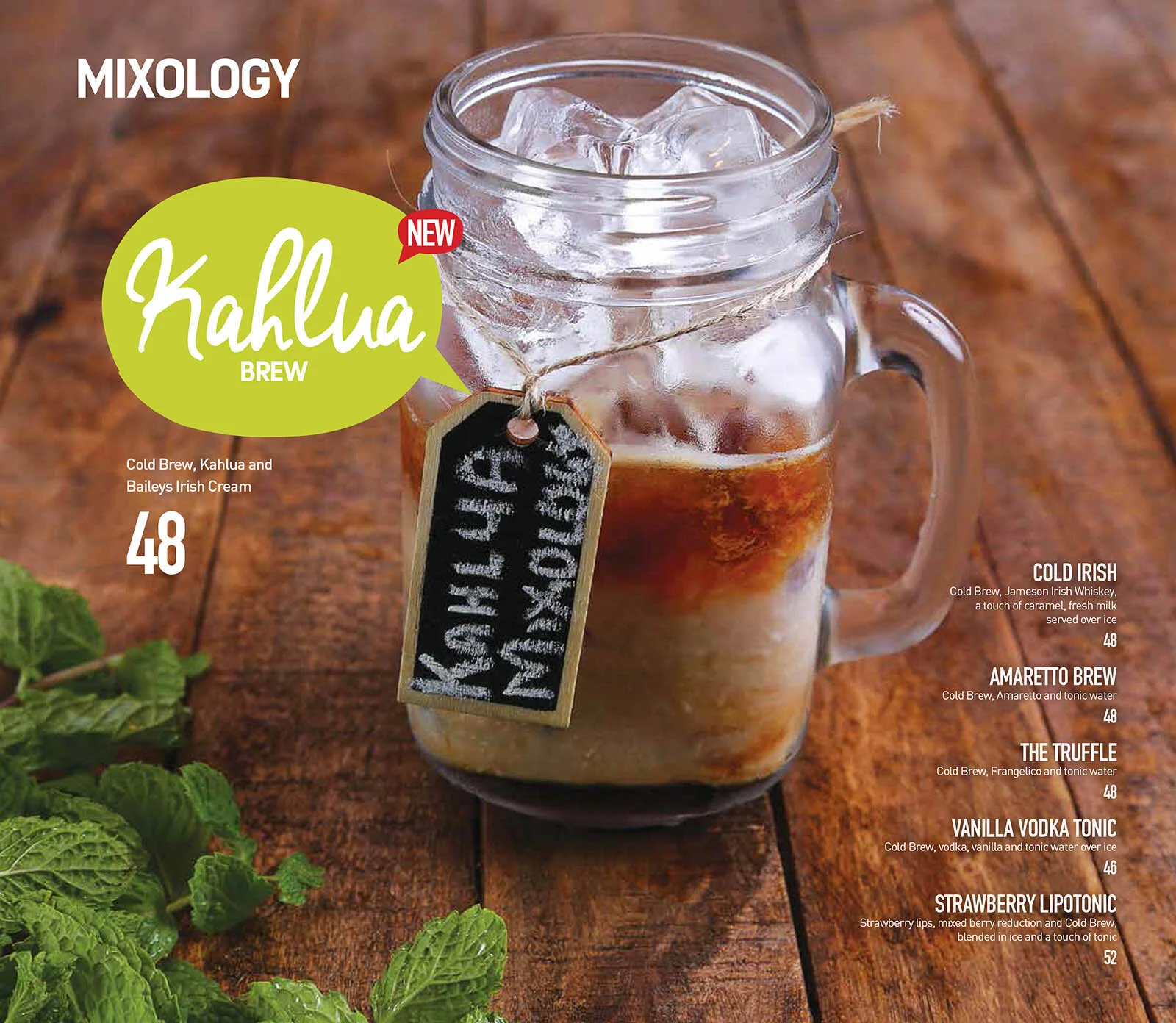
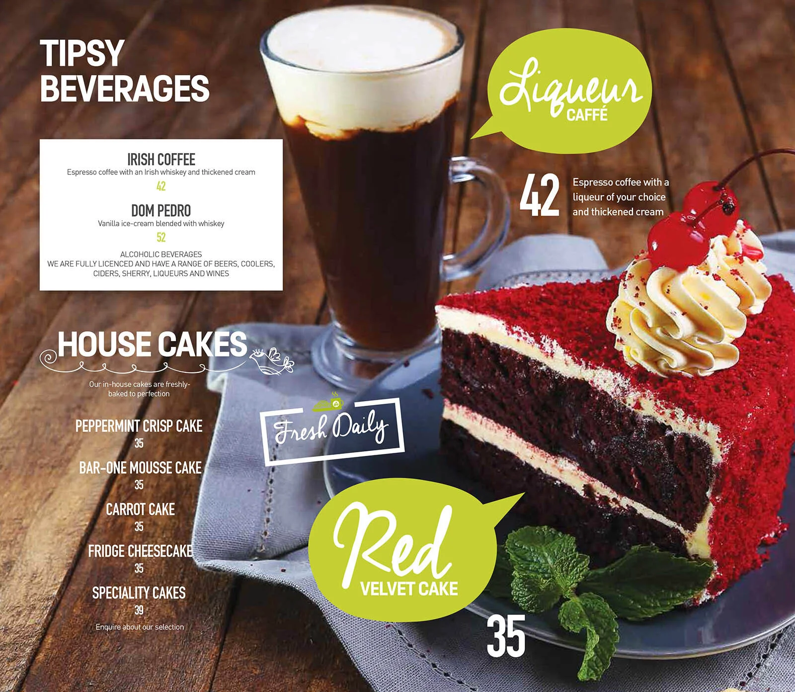
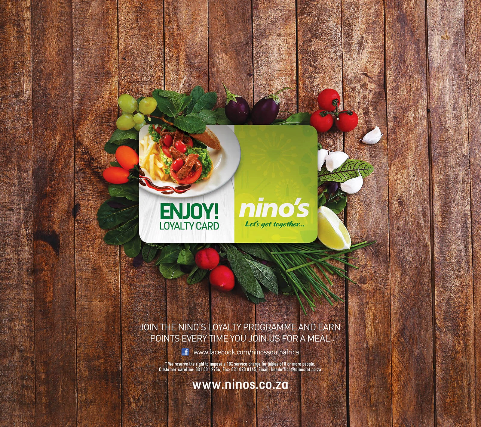
Here are some of the images we created for the new menu. If you happen to be in any of the Nino’s stores all the menus around the country were photographed by me and my amazing team.
When it comes to running campaigns for food brands and collaborating with an advertising agency there is a lot of work that goes on behind the scenes of these menus. Most of the time we use two different backgrounds for each dish (more than that becomes tricky and takes time away from working on the dish because you spend all your time swapping backgrounds) to make sure we have enough options for the designers to use in their designs and overlays. Using different backgrounds also create a nice artistic break in the final designs as it allows the viewer to get a refreshing perspective as they flip through the menu.
There are also elements that will be photographed that we as a team think would be interesting to use later in the design process or the advertising agency might have asked for it.
After spending all the time and money on these campaigns the last thing we would want is for the client to ask what if we had done this or need extra elements.
Here is the final menu. You can also view the menu in any Nino’s branch around the country.
